The Content division within the email template creation process allows users to customize the layout and elements of their email template. This division consists of three main sections: Content, Blocks, and Body. In this guide, we'll focus on the Content section, which provides users with a wide range of elements to drag and drop into their template design.
STEP 1: Give your template a name, then start editing
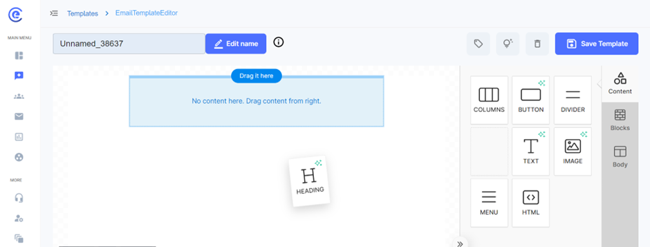
The Content section offers users a variety of elements that can be dragged from the right panel and dropped into their email template design. These elements include columns, buttons, dividers, headings, text blocks, images, menus, and HTML blocks. Each element serves a specific purpose in structuring and enhancing the visual appeal of the email template.
Users can drag and drop elements from the right panel into the template canvas to build their desired layout. For columns, users can select between desktop and mobile views and divide them into sections of different percentage sizes. Each column can be customized with individual colors, paddings, borders, and border styles. Users can also add images directly within column sections or provide image URLs for dynamic content.
1.Columns:
Desktop and Mobile Views: Users can create responsive email layouts by designing separate column structures for desktop and mobile views. This ensures that email templates display correctly and optimally across various devices and screen sizes.
Customization: Columns can be divided into sections of different percentage sizes, allowing for flexible layout configurations. Users can adjust the width of each section to achieve the desired balance of content and whitespace.
Styling Options: Each column can be customized with individual colors, paddings, borders, and border styles. Users have the flexibility to create visually appealing designs that align with their brand identity and messaging.
Image Integration: Users can easily add images within column sections by uploading image files or providing image URLs. This allows for seamless integration of visual content into email templates, enhancing engagement and aesthetics.
Mobile Responsiveness:
- Responsive Design: To ensure optimal viewing experiences on mobile devices, users can make design adjustments specifically for mobile views. This includes hiding certain elements on mobile or preventing them from stacking vertically to maintain the layout's integrity.
- Hiding Elements: Users can choose to hide specific elements on mobile devices to optimize the email's appearance and functionality. This ensures that mobile users receive a streamlined and user-friendly experience without unnecessary clutter.
- Non-Stacking Design: By configuring elements to not stack vertically on mobile devices, users can maintain the desktop layout's structure and visual hierarchy. This helps preserve the intended design aesthetics and ensures consistency across different devices.
2.Buttons:
Button Options:
- Button Color: Users can choose the background color of the button to align with their brand colors or design aesthetic.
- Text Color: Users can specify the color of the button text to ensure readability and visual appeal.
- Text Width: Users can adjust the width of the button text to control its appearance and layout within the button.
- Font: Users can select from a range of font options to customize the appearance of the button text.
- Font Weight: Users can choose between regular or bold font weights to emphasize the button text as needed.
- Font Size: Users can specify the font size of the button text to ensure readability and visual hierarchy.
- Text Alignment: Users can align the button text to the left, center, or right to achieve the desired visual balance within the button.
Spacing:
- Line Height: Users can set the line height of the button text to control the spacing between lines and ensure readability.
- Padding: Users can add padding to the top, bottom, left, and right sides of the button to adjust its size and spacing within the email template.
- Border: Users can specify border styles for the button, including border sides, all sides, and rounded borders. This allows for further customization of the button's appearance.
- General Container Padding: Users can set the padding for the overall container containing the button to control the spacing within the email template and maintain visual consistency.
- Responsive Design: Users can optimize button appearance and functionality for mobile devices by hiding certain elements on desktop or applying responsive design principles. This ensures a seamless user experience across different devices and screen sizes.
3.Divider Feature:
Introduction: The Divider feature is an essential tool for structuring and segmenting content within an email template. By adding visual breaks, dividers help improve readability and organize information effectively. In this guide, we will explore the various customization options available for dividers, including line width, line style, alignment, container padding, and responsive design considerations.
Line Width:
- Explanation: The line width option allows users to specify the thickness of the divider line. A thicker line can provide a more prominent visual break, while a thinner line offers a subtle separation.
- Customization: Users can adjust the line width to fit the design aesthetics of their email template. The flexibility to control the thickness ensures that dividers complement the overall layout and design.
Line Style:
- Solid Line: A continuous line that offers a clear and straightforward separation between sections.
- Dotted Line: A series of dots that create a less formal, yet distinct break in content. This style can add a touch of creativity to the email design.
- Dashed Line: A series of dashes that provide a clear but less rigid separation. This style is a middle ground between solid and dotted lines.
- Customization: Users can choose the appropriate line style to match the tone and style of their email content. Each line style offers a unique visual effect that can enhance the overall design.
Alignment:
- Left Alignment: Positions the divider line to the left side of the email template. This can be useful for aligning with other left-aligned content elements.
- Center Alignment: Centers the divider line within the email template, providing a balanced and symmetrical appearance.
- Right Alignment: Positions the divider line to the right side of the email template. This can be used to align with other right-aligned content elements.
- Customization: Users can align the divider line according to their design preferences and the layout of their email content. Proper alignment ensures that the divider integrates seamlessly with other elements.
Container Padding:
- Explanation: Container padding refers to the space around the divider line within its container. Adjusting the padding helps control the spacing between the divider and adjacent content.
- Customization: Users can set padding on the top, bottom, left, and right sides of the divider. This allows for precise control over the spacing and ensures that the divider does not appear cramped or too isolated.
- Example: Increasing the top and bottom padding can create more whitespace around the divider, enhancing the readability and visual appeal of the email.
Responsive Design:
- Explanation: Responsive design ensures that dividers and other elements in the email template adjust appropriately for different screen sizes and devices.
- Responsive Settings: Users can configure the divider to hide on specific devices (e.g., hide on mobile or desktop) to ensure the email maintains a clean and organized appearance across all devices.
- Non-Stacking Design: Users can prevent the divider from stacking vertically with other elements on mobile devices, maintaining the intended layout and design aesthetics.
- Importance: Responsive design ensures that the email template looks professional and functions well on both desktop and mobile devices, providing a consistent user experience.
The Divider feature is a versatile tool for enhancing the structure and readability of email templates. By customizing the line width, style, alignment, and container padding, users can create visually appealing and well-organized emails. Additionally, incorporating responsive design principles ensures that dividers and other elements display correctly across various devices and screen sizes. Utilizing the Divider feature effectively helps deliver a polished and engaging email experience to recipients.
4.Heading:
The Headings feature is crucial for organizing and emphasizing content within an email template. Proper use of headings improves readability, guides the reader through the content, and enhances the overall design. This guide explores the customization options for headings, including text formatting, heading types, font settings, alignment, and responsive design.
Text Formatting:
- Superscript: Users can apply superscript formatting to text within headings, which raises the text slightly above the normal line of text. This is useful for footnotes or special notations.
- Subscript: Users can apply subscript formatting, lowering the text slightly below the normal line of text. This is often used in chemical formulas or mathematical expressions.
- Italic: Users can italicize text to emphasize certain words or phrases, adding a touch of style and variation to the headings.
- Underline: Underlining text can help highlight important headings, making them stand out more prominently.
- Bold: Bold text is used to strongly emphasize key headings, ensuring they capture the reader's attention.
- Insert Link/Remove Link: Users can insert hyperlinks into headings, allowing readers to click and navigate to other web pages or resources. The remove link option is available to delete hyperlinks as needed.
- Include Emojis: Emojis can be added to headings to convey emotions, themes, or specific points in a visually engaging way.
Heading Types:
- H1: The primary heading, typically used for the main title of the email. It is the largest and most prominent heading.
- H2: Secondary heading, used for major sections within the email. It is slightly smaller than H1 but still quite prominent.
- H3: Tertiary heading, used for sub-sections within major sections. It is smaller than H2 but still stands out.
- H4: Quaternary heading, used for minor sections or sub-sub-sections. It is the smallest heading but provides clear differentiation from the main content.
Font Settings:
- Font Type: Users can choose from a variety of fonts to match their brand identity and design preferences.
- Font Weight: Options for font weight include regular and bold, allowing for varying levels of emphasis within headings.
- Font Size: Users can specify the font size to ensure headings are appropriately sized for readability and visual hierarchy.
- Color: Text color can be customized to align with the overall design scheme of the email template.
- Text Alignment: Users can align headings to the left, center, or right to fit the design and layout of the email.
- Line Height: Line height can be adjusted to control the spacing between lines of text within headings, enhancing readability and appearance.
Inherit Body Styles and Container Padding:
- Inherit Body Styles: Users can choose to inherit the overall body styles of the email template, ensuring a consistent look and feel throughout the content.
- Container Padding: Padding around headings can be adjusted to control the spacing between headings and other content elements. This includes padding on the top, bottom, left, and right sides of the headings.
Responsive Design:
- Explanation: Responsive design ensures that headings display correctly on various devices, including desktops, tablets, and mobile phones.
- Responsive Settings: Users can configure headings to adjust in size and alignment for different screen sizes, maintaining readability and visual appeal.
- Importance: Proper responsive design ensures that headings are clear and effective across all devices, providing a consistent and user-friendly experience.
The Headings feature within the email template creation process offers a wide range of customization options to enhance the structure and visual appeal of email content. By utilizing text formatting, heading types, font settings, text alignment, line height, body styles, and responsive design, users can create clear, engaging, and visually appealing headings. Effective use of the Headings feature helps guide readers through the email content, highlighting important sections and improving the overall reading experience.
5.Text Box Feature:
The Text Box feature is a fundamental element for adding and customizing text within an email template. This feature allows users to insert and format text, making it a versatile tool for conveying information, messages, and calls to action. In this guide, we will explore the various customization options available for text boxes, including text formatting, font settings, alignment, spacing, and responsive design.
Link Options:
- Insert Link: Users can hyperlink text to direct readers to external web pages, resources, or additional content. This is essential for calls to action or providing further information.
- Remove Link: Users can remove hyperlinks from text as needed to ensure the content is accurate and relevant.
Responsive Design:
- Explanation: Responsive design ensures that text boxes and their content display correctly on various devices, including desktops, tablets, and mobile phones.
- Responsive Settings: Users can configure text boxes to adjust in size and alignment for different screen sizes, maintaining readability and visual appeal.
- Hiding Elements: Users can choose to hide certain text boxes on mobile or desktop versions to optimize the layout for different devices.
- Non-Stacking Design: Ensures that text boxes do not stack vertically on mobile devices unless intended, preserving the layout's intended structure.
Image:
Explanation: Users can upload images from their computer or select from a library of pre-uploaded images. This ensures that the visuals align with the brand’s style and the email’s purpose.
Process: Users click on the image block, choose the upload option, and select the desired image file from their device. The image is then inserted into the email template.
Image URL:
- Explanation: Users can link to an image hosted online by providing its URL. This is useful for including dynamically updated images or images stored in online repositories.
- Process: Users insert the image URL into the designated field, and the image is displayed within the email template.
Borders and Padding:
- Borders: Users can add borders to images, specifying the border color, width, and style (solid, dotted, dashed, etc.). This helps in highlighting the image and adding a finishing touch to the design.
- Padding: Users can set padding around the image to control the spacing between the image and surrounding content, ensuring a clean and organized layout.
Responsive Design:
- Explanation: Ensures that images are displayed correctly on various devices, including desktops, tablets, and mobile phones.
- Responsive Settings: Users can configure images to resize and adjust automatically based on the screen size, maintaining visual appeal and functionality.
- Hiding Elements: Users can choose to hide images on specific devices (e.g., hide on mobile) to optimize the layout and performance for different viewing experiences.
The Add Images feature is a powerful tool for enhancing email templates with visual content. By uploading images, linking to image URLs, customizing image settings, and ensuring responsive design, users can create visually engaging emails that captivate their audience and improve overall communication.
6.Menu:
The Menu feature in the email template creation process enables users to add navigational links, improving the user experience by allowing easy access to different sections or external web pages. Users can create a menu by inserting a menu block and adding links, specifying the link text and URL for each item. Customization options include adjusting font type, size, color, and style to match the email's design, as well as aligning the menu and setting spacing and padding for a clean appearance. The feature also supports responsive design, ensuring menus display correctly on various devices like desktops, tablets, and mobile phones, and adapt to different screen sizes to maintain functionality and visual appeal. Overall, the Menu feature enhances email templates by providing organized and effective navigation, guiding recipients through the email content or to external resources.
7.HTML
The HTML feature in the email template creation process allows users to insert custom HTML code for advanced customization and functionality. By adding an HTML block, users can create unique elements, styles, and interactive features not available through standard design tools. This flexibility enables the implementation of complex layouts, personalized content, and third-party integrations. Additionally, users can ensure their HTML content is responsive, adapting to various screen sizes and devices for optimal display. Overall, the HTML feature enhances email templates by offering greater control over design and interactivity, providing a tailored and engaging user experience.
8.Blocks
The Blocks feature in the email template creation process allows users to create versatile and customizable sections within their emails. Users can divide blocks into different spaces and sizes to organize content effectively. Each block can be colored individually, providing a visually appealing and organized layout. Users can adjust the size and padding of each block, ensuring the content fits well and looks balanced. The text color within blocks can also be customized to match the overall design theme.
Additionally, users can insert images or link to image URLs within blocks, adding visual interest and enhancing the message. Each block can have its own padding settings, controlling the space around the content to avoid a cramped appearance. The Blocks feature supports responsive design, ensuring that blocks adapt to various screen sizes and devices, maintaining readability and visual appeal across desktops, tablets, and mobile phones. This flexibility allows for the creation of engaging, well-structured, and visually cohesive email templates.
9.Body:
The Body feature in email template creation serves as the canvas for crafting captivating and informative email content. With options to customize text color and background color, users can create visually striking emails that capture recipients' attention from the moment they open the message. Additionally, the ability to adjust content width ensures that emails maintain a polished appearance across various devices, enhancing the user experience and readability. Aligning content to specific positions within the email layout allows for precise control over the presentation, ensuring that each element is strategically placed for maximum impact. Furthermore, users can select font families and weights to convey their brand's personality and tone effectively, adding a touch of professionalism or creativity as desired.
Moreover, the Body feature encompasses essential email settings that contribute to the overall effectiveness of email campaigns. Including pre-header text enables users to provide a sneak peek or teaser of the email's content, enticing recipients to engage further. Customizing link colors and underlining links not only ensures consistency with the brand's visual identity but also enhances the accessibility and usability of the email by making links easily identifiable. These features collectively empower users to create engaging and visually appealing email content that resonates with recipients, driving higher open rates, click-through rates, and ultimately, achieving marketing objectives with greater efficacy.
STEP 2: Save your template
After saving your template, your UI must look like this:
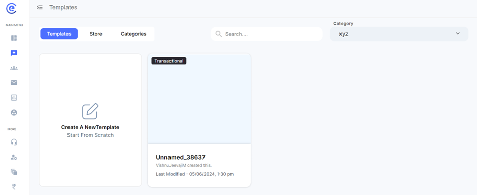
You may create new categories under the categories subsection to create new templates!
In conclusion, the email template creation process offers a comprehensive array of features and customization options to empower users in crafting compelling and impactful email campaigns. From designing visually stunning layouts to fine-tuning text styles and settings, each aspect of the process contributes to creating engaging and effective communication with recipients. The ability to customize various elements such as headings, images, menus, and blocks ensures that emails are not only visually appealing but also well-structured and user-friendly. Furthermore, features like HTML integration and responsive design enable users to implement advanced functionalities and ensure seamless compatibility across different devices and screen sizes. By leveraging these tools and capabilities, businesses can deliver tailored and engaging content to their audience, driving higher engagement, conversion rates, and ultimately, achieving their marketing goals with greater success. Overall, the email template creation process facilitates the creation of impactful email campaigns that leave a lasting impression on recipients and drive meaningful results for businesses.


